Posted by Steve Dietz on January 15, 2005 12:07 AM
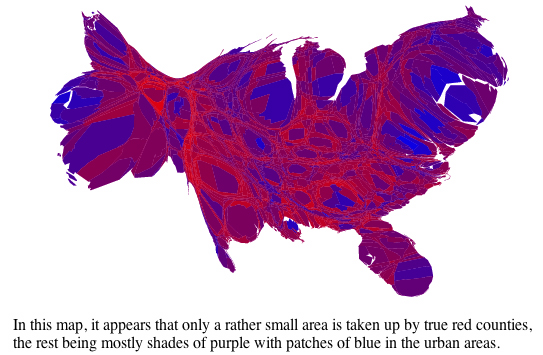
Michael Gastner, Cosma Shalizi, and Mark Newman from the University of Michigan do a very interesting analysis of the 2004 U.S. election results using cartograms: maps in which the sizes of states have been rescaled according to their population. The map below adjust the basic red-blue map for population by county and percentage of vote that went to each party in the county as opposed to the winner-take-all results.